
Many website designers underestimate the power of white space when it comes to creating a visually appealing color palette.
White space, or negative space, doesn’t have to be boring or wasted space on your website. In fact, when used strategically, white space can enhance the colors on your website and make them pop.
In this post, we will explore how you can use white space to breathe life into your color palette and create a website that is both visually stunning and user-friendly.
Key Takeaways:
- White space is your best friend: Embrace the power of white space to let your website’s colors shine and create a clean, modern look.
- Balance is key: Use white space strategically to create a balanced layout and prevent colors from overwhelming each other.
- Highlight important elements: Use white space to draw attention to key elements on your website, such as call-to-action buttons or important information.
- Enhance readability: White space around text blocks can improve readability and make your content more engaging for users.
- Think of white space as a color: Treat white space as an important part of your color palette and use it to enhance the overall visual impact of your website.

The Art of White Space
Defining White Space in Web Design
Some say that white space is the glue that holds a website’s design together. But what exactly is white space? In web design, white space refers to the empty areas between elements on a webpage.
It’s the breathing room that allows your content to shine and your color palette to pop.
White space doesn’t always have to be white; it can be any color or texture that helps create balance and harmony on your site.
The Psychological Impacts of White Space
If you think white space is just for aesthetics, think again! The psychological impacts of white space on website visitors are profound.
The strategic use of white space can help improve readability, guide users’ attention, and evoke emotions.
Studies have shown that too much clutter on a webpage can overwhelm visitors, while the right amount of white space can create a sense of elegance and sophistication.
The power of white space lies in its ability to influence how users perceive your brand.
By incorporating ample white space in your design, you can convey a sense of modernity, professionalism, and trustworthiness.
So, don’t underestimate the impact of those blank areas on your website – they’re doing more than just looking pretty!
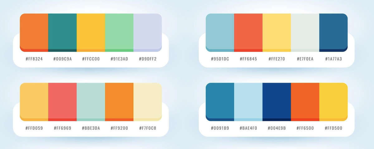
The Color Palette Conundrum
Even the most seasoned web designers can find themselves grappling with the color palette conundrum.
With so many hues and tones to choose from, selecting the perfect color scheme for your website can feel like a daunting task. However, fear not!
By strategically utilizing white space, you can enhance your color palette and create a visually stunning website that captivates your audience.
Basics of Choosing a Color Palette
Little do people realize that the key to a successful color palette lies in understanding the basics. Start by considering the emotions you want to evoke with your website.
Are you aiming for a bold and energetic vibe, or perhaps a more calming and serene feel?
Once you have a direction in mind, choose a main color that reflects those sentiments and then select complementary colors to complete the palette.
Don’t be afraid to play around with different shades and tints to find the perfect balance.
How White Space Can Make Colors Pop
Assuming you’ve nailed down your color palette, it’s time to let white space work its magic. By strategically incorporating white space around your colorful elements, you create visual breathing room that allows the colors to shine.
White space not only enhances the overall aesthetic appeal of your website but also helps draw attention to key elements. Whether it’s a vibrant call-to-action button or a striking image, white space can make your colors pop in all the right places.
It’s amazing how a little bit of white space can go a long way in elevating your color palette.
So, don’t underestimate the power of this often-overlooked design element. Embrace the white space and watch as your colors come to life in ways you never imagined!
Balancing Act: White Space vs. Content
The Goldilocks Principle of White Space
White space is like Goldilocks searching for the perfect bowl of porridge – not too hot, not too cold, but just right.
In the world of web design, finding the ideal amount of white space is crucial for creating a visually appealing and user-friendly website.
Too much white space can make a website feel empty and unfinished, while too little can result in a cluttered and overwhelming layout.
Tips for Achieving the Perfect Balance
Keep your content in check by giving it room to breathe. Recall, white space doesn’t have to be literally white – it’s the empty space around and between elements on your website.
To strike the right balance, consider the size and spacing of your text, images, and other elements to ensure a harmonious layout.
- Avoid the temptation to fill every inch of your website with content. Embrace the white space and let your design elements shine.
The key is to find that sweet spot where your content is the main attraction, but the white space enhances its overall impact.
By mastering this delicate balance, you can create a website that is both visually stunning and user-friendly.

Strategic Positioning
White Space and Visual Hierarchy
Unlike what some may believe, white space is not just empty space on a webpage. It plays a crucial role in establishing visual hierarchy, guiding the viewer’s eye towards the most important elements on your website.
By strategically incorporating white space around key content and design elements, you can enhance the overall visual appeal and impact of your color palette.
Tips for Effective White Space Positioning
For a harmonious color palette that truly pops, consider the strategic positioning of white space.
Use generous margins and padding around text blocks, images, and buttons to give them room to breathe and stand out.
Be mindful of, less is often more when it comes to white space – don’t overcrowd your design with unnecessary elements.
- Avoid cluttering the page with too many competing elements
- Focus on creating balance and flow with strategic white space
Positioning white space effectively can be the key to elevating your website’s color palette and creating a visually stunning experience for your visitors. By implementing these tips, you can enhance the overall design aesthetic and make important elements pop.
Technical Tips for Implementing White Space
Many websites overlook the importance of white space in their design, but strategic use of this negative space can truly enhance the overall aesthetic appeal.
With respect to implementing white space effectively on your website, there are several technical tips to keep in mind.

Coding for Clarity: HTML & CSS Tips
- Use margin and padding properties in CSS to create white space between elements.
- Avoid cluttering your HTML code with unnecessary divs and spans, and use semantic HTML elements for better organization.
Assume that by following these coding best practices, you can create a cleaner and more visually appealing website that is easier for users to navigate through.
Responsive Design: White Space on Different Devices
Devices For instance, on a mobile device, white space can help prevent users from accidentally tapping on the wrong elements due to the smaller screen size.
By strategically using padding and margins in your CSS, you can ensure that your website looks great and functions well on any device.
Preventing Common Pitfalls
Overuse of White Space: When Less Is Too Little
One of the common pitfalls in using white space on your website is overdoing it.
While white space is crucial for creating a clean and organized layout, too much of it can result in a sparse and empty look, making your website feel incomplete or lacking in content.
The Trap of Monotony: Factors to Keep Your Website Dynamic
One of the challenges in designing a website with a color palette enhanced by white space is falling into the trap of monotony.
To prevent this, consider factors like varying font sizes, incorporating different textures or patterns, and using images strategically to break up the white space and create visual interest.
- Experiment with different color accents to add pops of color and create a focal point.
- Use animations or interactive elements to engage users and keep them interested in exploring your website.
Little Space
Concerning combating the trap of monotony, remember that white space is your friend. It provides breathing room for your content and helps guide the user’s eye through the page.
Without enough white space, your website can feel cluttered and overwhelming, leading to a negative user experience.
- Perceiving a balance between white space and content is key to keeping your website visually appealing and engaging.
Final Words
Upon reflecting on the strategic use of white space to enhance your website’s color palette, it becomes clear that this often-overlooked design element is a powerful tool in creating a visually appealing and user-friendly website.
By strategically incorporating white space, you can make your colors pop, improve readability, and guide your visitors’ focus to the most important elements on your site. Keep in mind, less is often more when it comes to white space!
So, the next time you’re designing or revamping your website, don’t underestimate the impact of white space.
Embrace it, use it strategically, and watch as your color palette comes to life in a way that captivates and engages your audience. White space isn’t just empty space – it’s a design choice that can elevate your website to new heights!