Sup fools?

Sup fools?
You know that your website's speed has a direct impact on user experience, search engine rankings, and conversion rates. A slow-loading site can lead to frustrated visitors, lower search engine rankings, and lost sales. As you strive to create a seamless online...
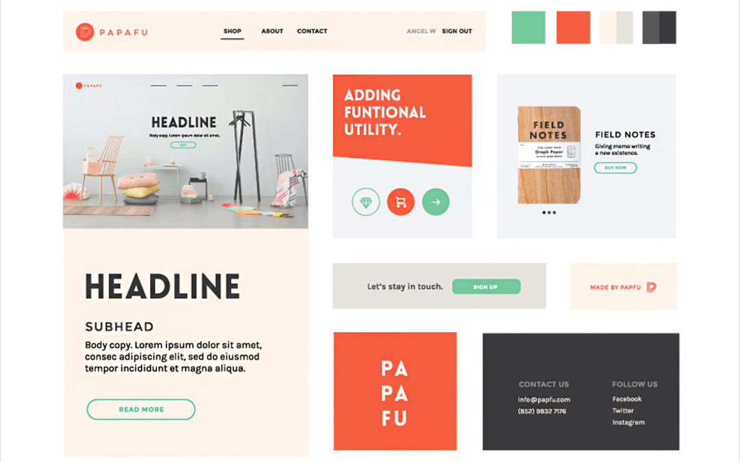
Most designers and marketers today rely on moodboards to set the style and tone of their website projects before exploring into the design phase. In this digital age, creating a captivating website moodboard has become easier and more dynamic thanks to tools like...
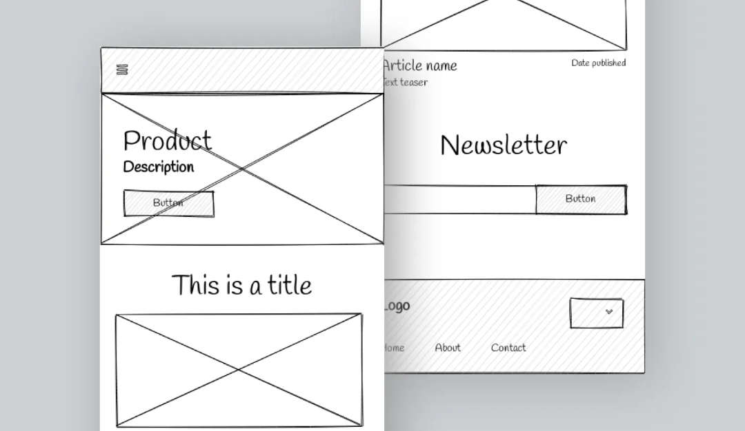
In the matter of wireframing, the fidelity of the design plays a crucial role in the development process. Low and high fidelity wireframes serve different purposes and cater to distinct stages of a project. Understanding the differences between the two is important...
Typography is the art of arranging type to make written language legible, readable, and visually appealing. In the digital age, the typography on your website speaks volumes about your brand before a visitor reads a single word. Typography encompasses everything from...

Conversion optimization is all about enhancing the rate at which website visitors become paying customers. The design of your landing page is critical in this journey. A thoughtfully crafted landing page guides visitors toward making a purchase and motivates them to...
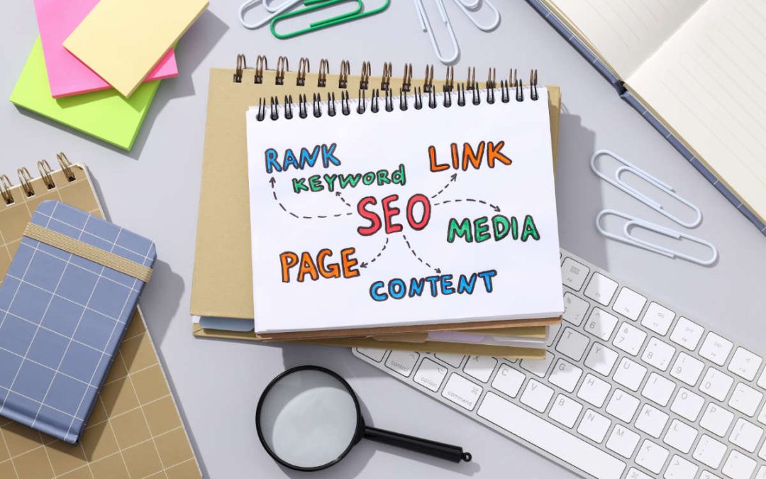
With the ever-evolving landscape of digital marketing, understanding the basics of on-page SEO is crucial for anyone looking to enhance their online presence. In this beginner's guide, we will probe into the fundamental principles of on-page SEO and how it can...
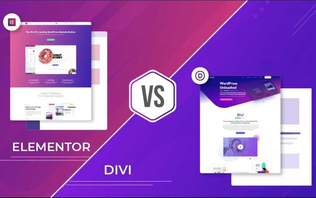
Let me get this out of the way; I am a Divi advocate through and through. This article will be 100% biased. I will however do my best to not drop to much poo on Elementor. With that said, let's get this thing going. Selecting the right page builder for your WordPress...
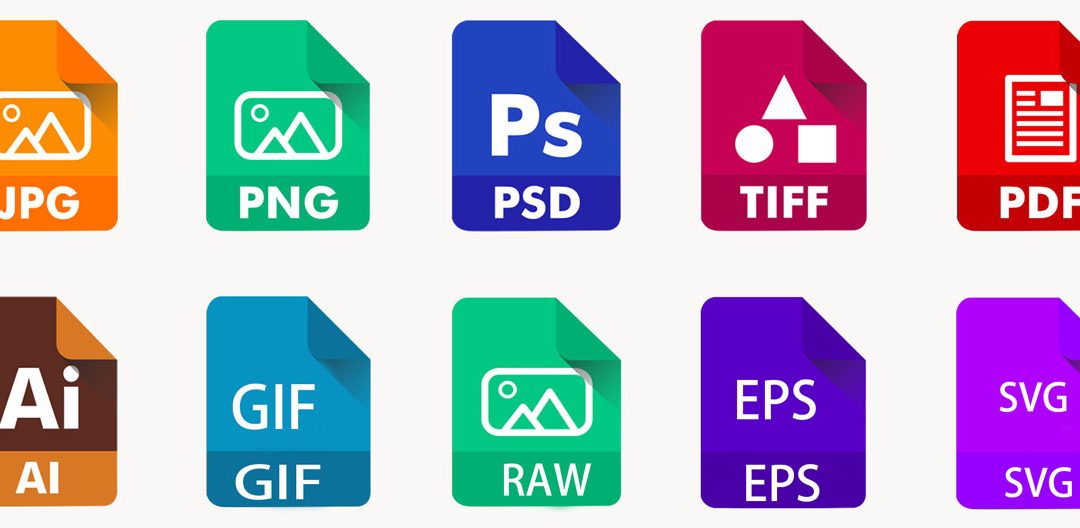
Over the years, image formats have played a crucial role in how visual content is displayed and shared across the digital landscape. An vital aspect of digital communication, understanding image formats is vital for anyone involved in creating, sharing, or editing...
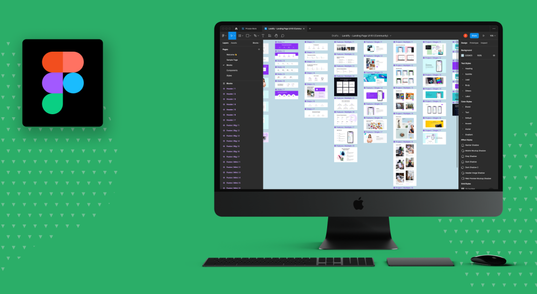
The world of design software is vast, but one platform that stands out from the rest is Figma. With its intuitive interface and collaborative features, Figma has become a favorite among designers looking for a versatile tool for their projects. While other design...