Blog

  • The Complete Guide to Understanding Image Formats

    The Complete Guide to Understanding Image Formats

    Over the years, image formats have played a crucial role in how visual content is displayed and shared across the digital landscape.

    An vital aspect of digital communication, understanding image formats is vital for anyone involved in creating, sharing, or editing visual content.

    From JPEG to PNG, each format has its unique characteristics and uses that can greatly impact the quality and performance of images online.

    One of the most widely used image formats is JPEG, known for its ability to compress images without sacrificing too much quality.

    Ideal for photographs and other complex images, JPEG files are compatible with a wide range of devices and platforms.

    However, the format’s lossy compression method can lead to a reduction in image quality over time with multiple saves.

    On the other hand, PNG is a lossless format favored for its ability to maintain image quality without compression artifacts. This makes it ideal for graphics, logos, and images that require transparency.

    In the context of GIF, this format is perfect for creating short, animated images that add a dynamic element to websites and social media posts.

    While limited in colors and resolution, GIFs are popular for their ability to convey quick, engaging visual messages.

    For those looking to preserve image quality while reducing file size, the WebP format offers an efficient solution.

    Developed by Google, WebP supports both lossy and lossless compression, making it a versatile choice for web designers and developers.

    Key Takeaways:

    • Understanding different image formats: Different image formats serve different purposes and it is important to know the differences between them. Each format has its own strengths and weaknesses that can affect the quality, size, and compatibility of an image.
    • Choosing the right format: Selecting the appropriate image format depends on the specific requirements of your project. For instance, if you need a high-quality image with transparent backgrounds, PNG would be a suitable choice. On the other hand, if you need a small file size for web graphics, JPEG might be a better option.
    • Lossy vs. Lossless compression: Understanding the difference between lossy and lossless compression is crucial. Lossy compression reduces file size by eliminating some data, which can result in a loss of quality. On the other hand, lossless compression compresses the file size without sacrificing image quality.
    • Transparency and color support: Some image formats, such as PNG and GIF, support transparent backgrounds, which can be useful for graphic design purposes. Additionally, different formats have varying color support capabilities, with some being better suited for displaying a wide range of colors.
    • Consideration for web optimization: When optimizing images for the web, it is crucial to strike a balance between image quality and file size. By choosing the right image format and compression settings, you can ensure that your web images load quickly without compromising on visual appeal.

    Fundamentals of Digital Imaging

    Little did we know that the world of digital imaging holds fascinating secrets waiting to be uncovered. In this chapter, we will explore the basics of digital imaging to lay a strong foundation for understanding image formats.

    Pixels and Color Models

    With every image you capture or create on a digital device, you are necessaryly working with a grid of tiny squares called pixels.

    These pixels are the building blocks of your image, each carrying specific color information.

    The collective arrangement of these pixels forms the visual masterpiece you see on your screen. Understanding pixels and color models is crucial in grasping how images are constructed and displayed across different devices.

    Compression: Lossy vs. Lossless

    Lossy compression involves reducing the file size of an image by discarding some of its data. This method is often used to make files smaller for efficient storage or faster transmission.

    While lossy compression can significantly reduce file size, it comes at a cost – a decrease in image quality due to lost data. On the other hand, lossless compression retains all the original data of an image, ensuring no loss in quality but resulting in larger file sizes.

    Compression plays a vital role in managing digital images efficiently. It allows for quicker transmission over networks and reduced storage space requirements without compromising image quality.

    However, it is important to carefully consider the type of compression used based on your specific needs, balancing between file size and image quality.

    Common Raster Image Formats

    Assuming you are delving into the world of digital imagery, understanding the various image formats is crucial. Raster image formats are the most common types used in digital photography, graphic design, and web development.

    Each format has its own set of characteristics, pros, and cons that determine its suitability for different purposes.


    JPEG: Pros, Cons, and Use Cases

    Pros: JPEG images are widely supported across different platforms and devices, making them highly versatile for sharing and displaying photos online.

    They offer a good balance between image quality and file size, making them ideal for web use where smaller file sizes are preferred to ensure faster loading times.

    Additionally, JPEG images can be easily compressed without significant loss of quality, allowing for efficient storage and transmission of images.

    Cons: One of the drawbacks of JPEG images is their lossy compression, which can lead to a reduction in image quality over time with repeated edits and saves.

    They are not well-suited for images with sharp edges or text, as compression artifacts can distort these elements.

    Additionally, JPEG is not suitable for images that require transparency or animations.

    PNG: Features, Limitations, and When to Use

    With the rise of digital design and the need for images with transparent backgrounds, PNG has become a popular choice for web graphics and logos. PNG images support lossless compression, preserving image quality while reducing file size.

    They are ideal for images with sharp edges, text, and transparency, making them a preferred format for web elements that require crisp details.

    Common web uses for PNG include logos, icons, and illustrations where preserving image quality and transparency are necessary.

    However, PNG files tend to be larger in size compared to JPEGs, which may impact loading times on web pages with multiple images.

    GIF: Understanding Its Animation Capabilities

    On the surface, GIFs may seem like fun, animated images used in memes and social media.

    However, they have a long-standing history of being one of the first image formats to support animation. GIFs are a series of images played in sequence, creating the illusion of movement.

    They are limited to 256 colors, making them best suited for simple animations, logos, and clipart.

    GIFs are popular for their ability to convey short, looping animations that add visual interest to websites and messages.

    They are widely supported across platforms and are easy to create and share.

    However, their color limitations and larger file sizes compared to other formats may restrict their use in more complex animations.

    BMP: Characteristics and Why It’s Less Common

    To understand the BMP format, one must go back to the early days of digital imaging. Bitmap (BMP) files store images pixel by pixel without compression, resulting in high-quality images but large file sizes.

    Due to their uncompressed nature, BMP files are less common in web and digital design where smaller file sizes are preferred for faster loading times.

    BMP images are known for their high color accuracy and support for transparency, making them suitable for printing and archival purposes where image quality is paramount.

    Their lack of compression and larger file sizes make them less practical for web use, where balancing quality and efficiency is key.

    WebP: The New Era of Image Formats

    Image formats are constantly evolving to meet the demands of modern digital experiences. WebP is a relatively new image format developed by Google, offering both lossy and lossless compression for web images.

    It boasts smaller file sizes with strong image quality, making it an attractive option for improving website performance.

    This format is gaining traction in web development for its ability to reduce image loading times and bandwidth usage without compromising visual fidelity. WebP images also support transparency and animations, making them a versatile choice for web designers looking to optimize performance and user experience.

    Understanding Vector Graphics

    Now, let’s discuss the fascinating world of vector graphics. Unlike raster images made up of pixels, vector graphics use mathematical equations to create shapes and lines.

    This means they can be scaled to any size without losing quality, making them ideal for logos, illustrations, and other designs that require crisp detail.

    Scalable Vector Graphics (SVG)

    One of the most popular vector formats is SVG. SVG files are lightweight and can be easily edited with a text editor or graphic design software. They are supported by most web browsers, making them perfect for web design.

    SVGs are favored for responsive design since they can scale to fit any screen size without losing clarity. Designers love using SVGs for icons, logos, and animations due to their versatility.

    Other Vector Formats (AI, EPS, PDF)

    Graphics created in Adobe Illustrator are typically saved in AI (Adobe Illustrator) format, which can be easily shared and edited in the software.

    EPS (Encapsulated PostScript) files are commonly used for printing and are compatible with various design programs.

    PDF (Portable Document Format) files are not just for documents; they also support vector graphics, making them accessible for both print and web projects.

    These formats provide excellent flexibility when working on projects that require high-quality graphics. AI and EPS files are go-to choices for print production, ensuring that your designs look sharp and professional.

    PDFs are versatile for sharing work with clients or collaborators who may not have design software installed. Understanding these vector formats will give you a solid foundation for creating and sharing stunning graphics.

    Advanced Image Formats and Technologies

    1. High Efficiency Image Format (HEIF/HEIC)

    Formats

    Unlike traditional image formats like JPEG and PNG, the High Efficiency Image Format (HEIF/HEIC) is a next-generation image container that offers superior compression and quality retention. Developed by the Moving Picture Experts Group (MPEG), HEIF uses advanced compression algorithms to store image data more efficiently.

    This format supports various media types, such as images, image sequences, audio, and image-based depth maps.

    Additionally, HEIF supports features like transparency, animations, and storage of image edits without compromising quality.

    HEIF’s successor, the High-Efficiency Video Coding (HEVC) standard, ensures that file sizes are significantly smaller compared to JPEG while maintaining high image quality.

    This next-level compression technology preserves image fidelity, making it an ideal format for storing a large number of images without taking up excessive storage space.

    1. RAW Image Formats in Photography

    Formats

    RAW image formats are the gold standard for professional photographers as they offer uncompressed, unprocessed image data directly from the camera’s sensor.

    These files contain all the information captured by the sensor without any loss of quality due to compression or processing.

    RAW files allow photographers to have complete control over the editing process, enabling them to adjust various aspects of the image like exposure, white balance, and sharpness with precision.

    Efficiency in photography is paramount, and RAW image formats provide photographers with the utmost flexibility and creative freedom during post-processing.

    While RAW files may take up more storage space than compressed formats like JPEG, the ability to produce the highest-quality images makes them indispensable for professionals seeking perfection in their work.

    Choosing the Right Image Format

    Considering the Purpose of the Image

    Keep in mind the purpose of the image when selecting the format. Is it a high-resolution photograph for a website, a logo for a business card, or an icon for an app?

    Understanding the intended use will help you determine the appropriate format to ensure the best quality and performance.

    It’s imperative to consider whether the image needs to support transparency, animation, or interactivity. Images with transparency are best saved as PNGs, while
    JPEGs are ideal for photographs with a wide range of colors.

    For simple graphics and logos, SVG is a scalable vector format that retains sharpness regardless of size.

    Balancing Quality and File Size

    Choosing the right image format involves finding a balance between quality and file size. Different formats have varying compression techniques that affect image quality.

    JPEG compression reduces file size but can lead to loss of quality, especially with repeated saving. PNG, on the other hand, supports lossless compression, maintaining image clarity but resulting in larger file sizes.

    Quality should not be compromised for smaller file sizes, especially for images that require high resolution or detail.

    Consider the importance of image clarity in relation to the file size limitations of your project.

    For web images, finding the right balance is crucial to ensure fast loading times without sacrificing visual appeal.

    Optimizing Images for the Web

    Tools for Image Optimization

    All images used on a website should be optimized to ensure they don’t slow down load times. Image optimization tools, such as TinyPNG, JPEG Optimizer, and Kraken.io, are designed to help reduce the size of image files without sacrificing quality.

    These tools use various compression techniques to minimize file size while maintaining visual integrity. Users can simply upload images to these platforms, which will then automatically compress them for faster web loading speeds.

    Best Practices for Faster Loading Times

    When creating images for the web, it’s crucial to follow best practices for faster loading times.

    This includes using the correct image format, such as JPEG for photographs and PNG for graphics with transparency. Images should also be appropriately sized before uploading to avoid scaling them in the browser, which can slow down loading times.

    Additionally, consider lazy loading images to ensure that only the images appearing in the viewport are loaded initially, improving overall performance.

    It’s important to minimize HTTP requests by combining smaller images into a CSS sprite or using data URIs for smaller images. Optimizing images for different screen resolutions can also significantly impact loading times.

    By utilizing responsive images and implementing srcset attributes, you can provide users with an optimized viewing experience based on their device’s screen size.

    Legal Considerations and Copyrights

    Understanding Image Licensing

    To legally use an image, you must obtain the appropriate licensing rights from the copyright owner. Failure to do so could result in costly legal consequences, including fines and penalties.

    When choosing images for your projects, always check the licensing agreements to ensure you have the right to use them.

    There are different types of licenses available, such as royalty-free, rights-managed, and creative commons, each with its own set of restrictions and permissions.

    It is crucial to understand the terms of the license before using the image to avoid any infringement issues.

    Copyright Issues and Image Formats

    To protect your own images, consider copyrighting them or using watermarks to prevent unauthorized use.

    Certain image formats may offer more robust copyright protection, such as TIFF or RAW files, which preserve more image data than JPEG or PNG formats. Be aware that simply altering an image’s format may not prevent copyright infringement, as the underlying content is still protected.

    It is imperative to familiarize yourself with the copyright laws in your jurisdiction to ensure you are safeguarding your intellectual property.

    Considering the copyright status of images is crucial when working with digital media. Always seek permission or obtain the necessary licenses before using images in your projects to avoid legal issues.

    Remember that even seemingly minor infringements can have significant consequences, so it is better to be safe than sorry when it comes to copyright and image formats.

    Future Trends in Image Formats

    Developments in Image Compression

    For the future of image formats, one of the most critical areas of innovation lies in image compression.

    New techniques and algorithms are being developed to create more efficient ways to store and transmit images without sacrificing quality.

    The goal is to reduce file sizes while maintaining high-resolution images. This not only saves storage space but also improves load times on websites and applications, enhancing user experience.

    Advancements in image compression technology are paving the way for faster transfer speeds and improved performance across various digital platforms.

    New methods such as machine learning and artificial intelligence are being utilized to enhance compression algorithms for better results.

    These developments are crucial for keeping up with the increasing demand for high-quality images in a fast-paced digital world.

    Predictions for New Image Format Standards

    To meet the evolving needs of digital content creators and consumers, there is a growing demand for new image format standards that offer higher quality and more advanced features.

    With the rise of virtual and augmented reality technologies, there is a need for image formats that can support these immersive experiences.

    Standardization bodies are likely to introduce new formats that cater to these requirements.

    Developments in image format standards are expected to focus on enhancing image quality, supporting transparency, and improving compression techniques.

    These new standards will not only benefit professionals working in industries such as graphic design, gaming, and photography but also improve the overall visual experience for users consuming digital content.

    Summing up

    Understanding different image formats is crucial for anyone working with digital media.
    Whether you are a designer, photographer, or content creator, having knowledge about the various options available will help you make informed decisions about the quality and size of your images.

    By recognizing the strengths and limitations of each format, you can optimize your images for different purposes, such as web publishing, print media, or social media.

    Keep in mind, the choice of image format can significantly impact the performance of your website or the quality of your printed materials.

    The next time you are preparing images for a project, take a moment to consider which format would be best suited for your needs.

    By selecting the right format and optimizing your images accordingly, you can ensure that your visual content is displayed at its best, reaching its full potential and leaving a lasting impression on your audience.

    Q: What is an image format?

    A: An image format refers to the specific way in which digital images are encoded and stored on a computer. It dictates the file extension of an image and determines how the image data is compressed and displayed. Common image formats include JPEG, PNG, GIF, and TIFF, each with its own unique characteristics and uses.

    Q: What is the difference between raster and vector image formats?

    A: Raster image formats, such as JPEG and PNG, are composed of individual pixels arranged in a grid to form an image. These formats are resolution-dependent, meaning they may lose quality when resized. On the other hand, vector image formats, like SVG and PDF, use mathematical equations to define shapes and lines, allowing for infinite scalability without loss of quality.

    Q: Why is choosing the right image format important?

    A: Selecting the appropriate image format is crucial as it directly impacts the quality, file size, and compatibility of an image. For instance, JPEG is ideal for photographs due to its efficient compression, while PNG is better suited for images with transparency. Understanding the strengths and limitations of each format helps in optimizing images for specific uses and platforms.

    Q: How does image compression work in various formats?

    A: Image compression reduces the file size of an image by eliminating redundant or unnecessary data while preserving visual quality. Lossy compression, used in JPEG and GIF formats, discards some data and may result in a slight loss of quality. In contrast, lossless compression, found in PNG and TIFF formats, retains all image data without compromising quality.

    Q: What are metadata and color profiles in image formats?

    A: Metadata consists of additional information embedded within an image file, such as camera settings, date taken, and copyright details. Color profiles define the color space used in an image, ensuring accurate and consistent color representation across devices. Understanding metadata and color profiles is important for maintaining image integrity and ensuring optimal viewing experiences.


  • What Sets Figma Apart From Other Design Software?

    What Sets Figma Apart From Other Design Software?

    The world of design software is vast, but one platform that stands out from the rest is Figma. With its intuitive interface and collaborative features, Figma has become a favorite among designers looking for a versatile tool for their projects.

    While other design software may offer similar features, Figma’s unique combination of functionality and ease of use sets it apart in the industry.

    From its real-time collaboration capabilities to its cloud-based storage, Figma allows designers to work seamlessly with team members from anywhere in the world.

    Additionally, its accessibility across different operating systems and devices makes it a versatile choice for design professionals.

    With Figma, designers can create stunning visuals and prototypes with ease, making it a top choice for those looking to streamline their workflow and produce high-quality designs.

    Key Takeaways:

    • Real-time Collaboration: Figma allows multiple users to work on a design project simultaneously, making it easy for teams to collaborate in real time.
    • Web-Based: Unlike many design tools, Figma is entirely web-based, meaning that designers can work on projects from any computer without the need to download software.
    • Auto Layout Feature: Figma’s Auto Layout feature automates the resizing and arrangement of design elements, making it quick and easy to create responsive designs for multiple devices.
    • Prototyping Capabilities: Figma offers robust prototyping tools that allow designers to create interactive prototypes to test usability and user flows.
    • Integrated Design System: Figma’s design system libraries enable designers to create a consistent and efficient workflow by sharing and reusing design assets across projects.


    User Interface and Experience

    Intuitive Design and Navigation

    There’s no denying that one of the key differentiators of Figma is its intuitive user interface that caters to both seasoned designers and beginners alike.

    The layout is clean and well-organized, making it easy to navigate through different menus and tools.

    Whether you are working on a small project or a complex design task, Figma’s interface allows for seamless navigation and efficient workflow.

    Customization and Accessibility Features

    The customization options and accessibility features in Figma set it apart from other design software in the market.

    The ability to create design systems, reusable components, and interactive prototypes within the same platform makes Figma a powerful tool for designers looking to streamline their workflow and collaborate effectively with team members.

    Additionally, Figma offers accessibility features such as color contrast checking and interactive components that ensure designs are inclusive and user-friendly.

    This commitment to customization and accessibility not only enhances the user experience but also promotes design consistency and usability across different platforms and devices.

    With Figma, designers can create designs that are not only visually appealing but also functional and accessible to all users.

    Real-Time Collaboration

    Multi-User Editing Capabilities

    Not all design tools offer the capability for real-time collaboration among team members, making it a game-changer in the design industry.

    With Figma, multiple users can work on the same project simultaneously, eliminating the need for the tedious process of sending files back and forth.

    Any changes made by one team member are instantly visible to others, enhancing efficiency and teamwork. This feature streamlines the design process and allows for seamless communication among team members, regardless of their physical locations.

    Comments and Feedback Integration

    On top of real-time collaboration, Figma also has a robust comments and feedback integration system.

    This feature allows team members to leave comments directly on the design file, pinpointing specific elements that need attention or revision.

    Collaboration in Figma goes beyond the real-time aspect, fostering a collaborative environment where multiple users can provide input and suggestions, leading to stronger design outcomes.

    Version History and Control

    An important aspect of collaboration is the ability to track changes and revert to previous versions if needed. Figma’s version history feature allows users to view past iterations of a design, making it easy to compare changes and track progress over time.

    Control over the design process is critical in a collaborative setting, and Figma’s version history and control functionalities give users the confidence to experiment and make edits without the fear of losing previous work.

    Platform Independence and Accessibility

    Cloud-Based Architecture

    After being founded in 2012, Figma has disrupted the design industry with its cloud-based architecture, setting it apart from traditional design software.

    This cloud-based approach allows designers to collaborate in real-time, regardless of their physical location. Design files are stored securely in the cloud, eliminating the need for manual file saving and ensuring that the latest version is always accessible.

    Cross-Platform Compatibility

    Any designer can attest to the frustration of switching between different devices and operating systems while working on a project.

    Figma solves this problem with its cross-platform compatibility, enabling seamless transitions between desktop and mobile devices. Whether you’re using a Mac, Windows, or even a Chromebook, Figma provides a consistent experience across all platforms.

    Apart from its desktop and mobile applications, Figma also offers a web-based platform that can be accessed through a browser.

    This means that designers can work on their projects from any device with an internet connection, further enhancing accessibility and flexibility.

    Offline Functionality and Performance

    Functionality

    Despite being a cloud-based tool, Figma understands the importance of offline functionality. Designers can download files for offline use, ensuring that they can continue working even without an internet connection.

    This feature is particularly useful for those who travel frequently or have limited access to the internet.

    Platform

    Figma’s offline functionality is complemented by its impressive performance, allowing designers to work with large design files without experiencing lag or delays.

    This combination of offline capabilities and high performance sets Figma apart from other design software, making it a top choice for professionals in the field.

    Extensibility and Integration

    Despite the many design tools available in the market, Figma stands out due to its extensive extensibility and integration capabilities.

    These features empower designers to enhance their workflow, streamline processes, and customize their design environment to suit their specific needs.

    Plugin Ecosystem

    Plugin support is one of the key features that sets Figma apart from its competitors. The Plugin Ecosystem in Figma allows users to access a wide range of third-party plugins that extend the software’s functionality.

    These plugins cover various aspects of the design process, from user experience and prototyping to project management and accessibility. With over 500 plugins available, designers can easily find tools that help them work more efficiently and creatively within the Figma platform.

    API and Third-Party Tool Integrations

    Integration capabilities in Figma go beyond just plugins. Figma offers an API that enables developers to create custom integrations with third-party tools and services.

    This API allows designers to connect Figma with other vital tools in their workflow, such as project management platforms, version control systems, and collaboration tools. By integrating Figma with their preferred tools, designers can centralize their workflow, automate repetitive tasks, and ensure seamless collaboration across their design projects.

    In addition to the API, Figma also offers direct integrations with popular tools like Jira, Trello, Slack, and Zeplin.

    These integrations streamline the design process further by enabling designers to directly transfer assets, update designs, and collaborate with team members without leaving the Figma platform.


    Advanced Design Features

    All great design software offers a range of advanced design features that help create high-quality designs efficiently. Figma stands out from the competition by providing a comprehensive set of tools that cater to the needs of both individual designers and collaborative teams.

    Let’s research into some of the key advanced design features that make Figma a go-to platform for designers.

    Vector Editing and Scalability

    Scalability

    1. Vector Editing: Figma’s robust vector editing capabilities allow designers to create and manipulate complex shapes with ease. The precision and flexibility offered by vector editing tools enable users to achieve pixel-perfect designs.
    2. Scalability: Figma’s vector graphics are resolution-independent, ensuring that designs remain crisp and clear across different devices and screen sizes. The scalability of vector elements in Figma makes it a reliable choice for creating responsive designs.

    Prototyping and Animation Tools

    Design

    Allowing designers to create interactive prototypes and animations directly within the design tool streamlines the design process and facilitates better communication among team members. Figma’s prototyping and animation tools enable designers to bring their designs to life, providing a more engaging experience for stakeholders during the review process.

    Responsive Design and Constraints

    Understanding

    1. Vector: Figma’s responsive design features empower designers to create layouts that adapt seamlessly to different screens and devices. By utilizing constraints and responsive design tools, designers can ensure that their designs maintain consistency and functionality across various platforms.

    Constraints

    Figma’s constraints feature allows designers to define how elements behave when the design is resized or adapted to different screen sizes.

    By setting constraints on objects, designers can maintain the intended design hierarchy and structure, ensuring a cohesive design system across all breakpoints.

    Pricing and Licensing Model

    Subscription-Based Model

    Many design software companies offer a subscription-based model, and Figma is no different. Users can choose between a free plan, suitable for personal projects with limited features, or opt for a paid subscription for more advanced capabilities.

    The paid plans include individual, professional, and organization options, each tailored to different needs and team sizes.

    Cost-Benefit Analysis Compared to Competitors

    One of Figma’s key advantages over its competitors is its cost-effectiveness. While some design tools require a hefty upfront payment or charge for updates, Figma offers a more affordable subscription model with regular updates included.

    This makes it easier for individuals and teams to budget for design software without compromising on quality or features.

    Cost-Benefit Analysis Compared to Competitors

    Criteria Figma
    Pricing Affordable subscription plans
    Updates Regular updates included in subscription

    Plus

    Many design software companies offer a subscription-based model, and Figma is no different. Users can choose between a free plan, suitable for personal projects with limited features, or opt for a paid subscription for more advanced capabilities.

    The paid plans include individual, professional, and organization options, each tailored to different needs and team sizes.

    Criteria Figma
    Pricing Affordable subscription plans
    Updates Regular updates included in subscription

    Community and Support

    Extensive User Community

    Unlike other design software, Figma boasts an extensive user community that is actively engaged in sharing tips, tricks, and resources to help fellow designers.

    An invaluable resource, this community provides a platform for users to connect, collaborate, and inspire one another.

    Whether you’re a beginner looking for guidance or an experienced professional seeking new perspectives, the Figma user community offers a wealth of knowledge and support.

    Educational Resources and Support

    On top of its vibrant user community, Figma goes the extra mile by offering a variety of educational resources and support options.

    From official documentation and tutorials to webinars and workshops, Figma provides users with the tools they need to master the software and stay up-to-date on the latest features and best practices. Whether you prefer self-paced learning or interactive sessions, Figma has you covered.

    Extensive educational resources and support ensure that users have the guidance they need to leverage Figma to its fullest potential.

    Whether you’re looking to enhance your design skills, troubleshoot a problem, or explore new techniques, Figma’s educational resources and support network are there to help you every step of the way.

    To wrap up

    So, in conclusion, Figma sets itself apart from other design software through its collaborative features, real-time editing capabilities, and cross-platform accessibility.

    Its cloud-based nature allows for seamless teamwork among designers, developers, and stakeholders, making it a go-to tool for modern design workflows.

    By offering a wide range of design and prototyping tools in one platform, Figma streamlines the design process and enhances productivity for teams of all sizes.


  • Strategically Use White Space To Enhance Your Website’s Color Palette

    Strategically Use White Space To Enhance Your Website’s Color Palette

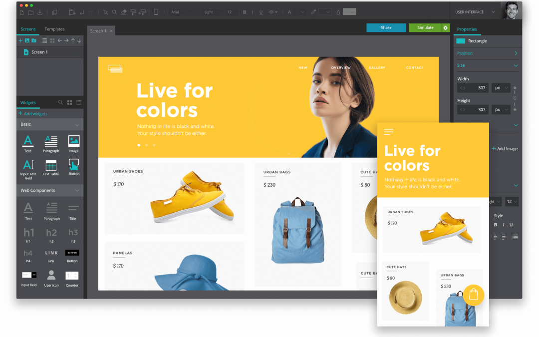
    Many website designers underestimate the power of white space when it comes to creating a visually appealing color palette.

    White space, or negative space, doesn’t have to be boring or wasted space on your website. In fact, when used strategically, white space can enhance the colors on your website and make them pop.

    In this post, we will explore how you can use white space to breathe life into your color palette and create a website that is both visually stunning and user-friendly.

    Key Takeaways:

    • White space is your best friend: Embrace the power of white space to let your website’s colors shine and create a clean, modern look.
    • Balance is key: Use white space strategically to create a balanced layout and prevent colors from overwhelming each other.
    • Highlight important elements: Use white space to draw attention to key elements on your website, such as call-to-action buttons or important information.
    • Enhance readability: White space around text blocks can improve readability and make your content more engaging for users.
    • Think of white space as a color: Treat white space as an important part of your color palette and use it to enhance the overall visual impact of your website.

    The Art of White Space

    Defining White Space in Web Design

    Some say that white space is the glue that holds a website’s design together. But what exactly is white space? In web design, white space refers to the empty areas between elements on a webpage.

    It’s the breathing room that allows your content to shine and your color palette to pop.

    White space doesn’t always have to be white; it can be any color or texture that helps create balance and harmony on your site.

    The Psychological Impacts of White Space

    If you think white space is just for aesthetics, think again! The psychological impacts of white space on website visitors are profound.

    The strategic use of white space can help improve readability, guide users’ attention, and evoke emotions.

    Studies have shown that too much clutter on a webpage can overwhelm visitors, while the right amount of white space can create a sense of elegance and sophistication.

    The power of white space lies in its ability to influence how users perceive your brand.

    By incorporating ample white space in your design, you can convey a sense of modernity, professionalism, and trustworthiness.

    So, don’t underestimate the impact of those blank areas on your website – they’re doing more than just looking pretty!

    The Color Palette Conundrum

    Even the most seasoned web designers can find themselves grappling with the color palette conundrum.

    With so many hues and tones to choose from, selecting the perfect color scheme for your website can feel like a daunting task. However, fear not!

    By strategically utilizing white space, you can enhance your color palette and create a visually stunning website that captivates your audience.

    Basics of Choosing a Color Palette

    Little do people realize that the key to a successful color palette lies in understanding the basics. Start by considering the emotions you want to evoke with your website.

    Are you aiming for a bold and energetic vibe, or perhaps a more calming and serene feel?

    Once you have a direction in mind, choose a main color that reflects those sentiments and then select complementary colors to complete the palette.

    Don’t be afraid to play around with different shades and tints to find the perfect balance.

    How White Space Can Make Colors Pop

    Assuming you’ve nailed down your color palette, it’s time to let white space work its magic. By strategically incorporating white space around your colorful elements, you create visual breathing room that allows the colors to shine.

    White space not only enhances the overall aesthetic appeal of your website but also helps draw attention to key elements. Whether it’s a vibrant call-to-action button or a striking image, white space can make your colors pop in all the right places.

    It’s amazing how a little bit of white space can go a long way in elevating your color palette.

    So, don’t underestimate the power of this often-overlooked design element. Embrace the white space and watch as your colors come to life in ways you never imagined!

    Balancing Act: White Space vs. Content

    The Goldilocks Principle of White Space

    White space is like Goldilocks searching for the perfect bowl of porridge – not too hot, not too cold, but just right.

    In the world of web design, finding the ideal amount of white space is crucial for creating a visually appealing and user-friendly website.

    Too much white space can make a website feel empty and unfinished, while too little can result in a cluttered and overwhelming layout.

    Tips for Achieving the Perfect Balance

    Keep your content in check by giving it room to breathe. Recall, white space doesn’t have to be literally white – it’s the empty space around and between elements on your website.

    To strike the right balance, consider the size and spacing of your text, images, and other elements to ensure a harmonious layout.

    • Avoid the temptation to fill every inch of your website with content. Embrace the white space and let your design elements shine.

    The key is to find that sweet spot where your content is the main attraction, but the white space enhances its overall impact.

    By mastering this delicate balance, you can create a website that is both visually stunning and user-friendly.

    Strategic Positioning

    White Space and Visual Hierarchy

    Unlike what some may believe, white space is not just empty space on a webpage. It plays a crucial role in establishing visual hierarchy, guiding the viewer’s eye towards the most important elements on your website.

    By strategically incorporating white space around key content and design elements, you can enhance the overall visual appeal and impact of your color palette.

    Tips for Effective White Space Positioning

    For a harmonious color palette that truly pops, consider the strategic positioning of white space.

    Use generous margins and padding around text blocks, images, and buttons to give them room to breathe and stand out.

    Be mindful of, less is often more when it comes to white space – don’t overcrowd your design with unnecessary elements.

    • Avoid cluttering the page with too many competing elements
    • Focus on creating balance and flow with strategic white space

    Positioning white space effectively can be the key to elevating your website’s color palette and creating a visually stunning experience for your visitors. By implementing these tips, you can enhance the overall design aesthetic and make important elements pop.

    Technical Tips for Implementing White Space

    Many websites overlook the importance of white space in their design, but strategic use of this negative space can truly enhance the overall aesthetic appeal.

    With respect to implementing white space effectively on your website, there are several technical tips to keep in mind.

    Coding for Clarity: HTML & CSS Tips

    • Use margin and padding properties in CSS to create white space between elements.
    • Avoid cluttering your HTML code with unnecessary divs and spans, and use semantic HTML elements for better organization.

    Assume that by following these coding best practices, you can create a cleaner and more visually appealing website that is easier for users to navigate through.

    Responsive Design: White Space on Different Devices

    Devices For instance, on a mobile device, white space can help prevent users from accidentally tapping on the wrong elements due to the smaller screen size.

    By strategically using padding and margins in your CSS, you can ensure that your website looks great and functions well on any device.

    Preventing Common Pitfalls

    Overuse of White Space: When Less Is Too Little

    One of the common pitfalls in using white space on your website is overdoing it.

    While white space is crucial for creating a clean and organized layout, too much of it can result in a sparse and empty look, making your website feel incomplete or lacking in content.

    The Trap of Monotony: Factors to Keep Your Website Dynamic

    One of the challenges in designing a website with a color palette enhanced by white space is falling into the trap of monotony.

    To prevent this, consider factors like varying font sizes, incorporating different textures or patterns, and using images strategically to break up the white space and create visual interest.

    • Experiment with different color accents to add pops of color and create a focal point.
    • Use animations or interactive elements to engage users and keep them interested in exploring your website.

    Little Space

    Concerning combating the trap of monotony, remember that white space is your friend. It provides breathing room for your content and helps guide the user’s eye through the page.

    Without enough white space, your website can feel cluttered and overwhelming, leading to a negative user experience.

    • Perceiving a balance between white space and content is key to keeping your website visually appealing and engaging.

    Final Words

    Upon reflecting on the strategic use of white space to enhance your website’s color palette, it becomes clear that this often-overlooked design element is a powerful tool in creating a visually appealing and user-friendly website.

    By strategically incorporating white space, you can make your colors pop, improve readability, and guide your visitors’ focus to the most important elements on your site. Keep in mind, less is often more when it comes to white space!

    So, the next time you’re designing or revamping your website, don’t underestimate the impact of white space.

    Embrace it, use it strategically, and watch as your color palette comes to life in a way that captivates and engages your audience. White space isn’t just empty space – it’s a design choice that can elevate your website to new heights!