
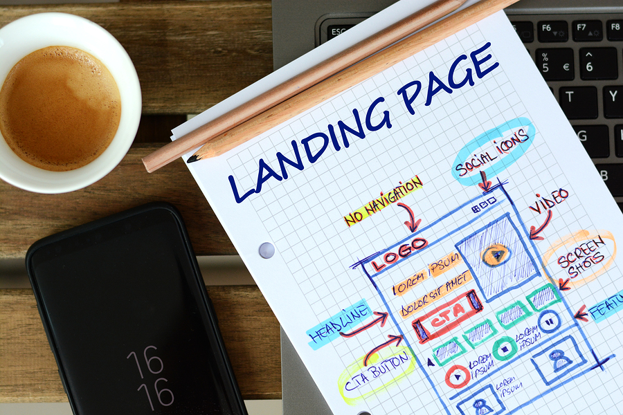
Conversion optimization is all about enhancing the rate at which website visitors become paying customers. The design of your landing page is critical in this journey.
A thoughtfully crafted landing page guides visitors toward making a purchase and motivates them to take action.
A landing page can serve various purposes: it might introduce your brand, showcase your products or services, or act as a hub for gathering essential customer data.
Recognizing the specific role of your landing page is the first step in customizing its design to better achieve its goals and, in turn, boost your conversion rates.
Now, let’s explore some effective design tips that can significantly enhance your landing page and lead to higher conversion rates:
Understanding the Role of Your
Landing Page
Before commencing the design process, it’s crucial to clearly define the main objective of your landing page.
What are you aiming to achieve with this page? Is the goal to collect email sign-ups, sell a product, or promote an event?
Establishing a clear purpose from the start will direct your design decisions and enable you to develop a more effective and focused landing page.
In the world of digital marketing, the landing page serves as a strategic tool tailored for a specific outcome.
Its objectives can vary widely—some pages are designed to enhance brand recognition, others are aimed at increasing sales, engaging customers, or generating leads.
Identifying these goals early in the process influences not only the design but also the content and the calls-to-action featured on the page.
Each design element should be intentionally aligned with the landing page’s purpose. This includes everything from the choice of colors and fonts to the placement of buttons and the style of imagery used.These elements should work together to create a cohesive and inviting visual environment that resonates with your target audience and enhances user engagement.
Furthermore, the functionality of the page should not be overlooked. It’s important that the page loads quickly, is easy to navigate, and is optimized for mobile devices, as a significant portion of users may access the page via smartphones or tablets.
A seamless user experience is key to keeping potential customers engaged and willing to take the desired action.
Understanding how your landing page functions within your overall digital marketing strategy is crucial for optimizing its effectiveness and boosting conversion rates.
This deep understanding allows you to make informed adjustments that enhance user experience and conversion potential over time.
By continuously analyzing the performance of your landing page and implementing improvements based on real user data, you can significantly increase the impact of your digital marketing efforts.
Crafting Effective Headlines for Conversion Optimization
The headline on your landing page often makes the first impression on your visitors. As such, it must be crafted with precision to be clear, concise, and compelling—designed specifically to catch the eye and hold attention.
It’s essential that your headline delivers the unique value proposition of your offer distinctly and persuasively.
Think of your headline as the gateway to your landing page. More than just a string of words, it serves as a powerful encapsulation of your brand’s core message.
A headline that is ambiguous or too complex can easily confuse visitors or misrepresent your offer, which might lead to a drop in conversion rates.
Conversely, a headline that is straightforward, engaging, and succinct not only grabs the attention of your audience but also sets accurate expectations about what your page is offering.

Creating an effective headline involves understanding your target audience intimately. What are their needs or pain points?
How does your product or service solve these issues? Your headline should resonate with this audience, sparking their interest and conveying your value proposition in a way that feels almost tailor-made for them.
This connection is crucial because it not only draws visitors in but also encourages them to move further down the conversion funnel.
The importance of headlines cannot be overstated—they’re not only a critical component of your landing page’s design but are also instrumental in guiding potential customers from initial curiosity to active interest.A well-crafted headline reflects the essence of your offer and enhances the overall user experience by ensuring that expectations set at the entrance align seamlessly with what is delivered throughout the page.
The success of your landing page hinges significantly on how effectively the headline communicates with your potential customers.
It should be a clear, concise, and compelling statement that not only captures attention but also perfectly encapsulates the value you’re offering, making it an indispensable tool in the arsenal of conversion optimization.
By crafting a headline that resonates with your audience and highlights your unique value proposition, you set the stage for increased visitor engagement and higher conversion rates.

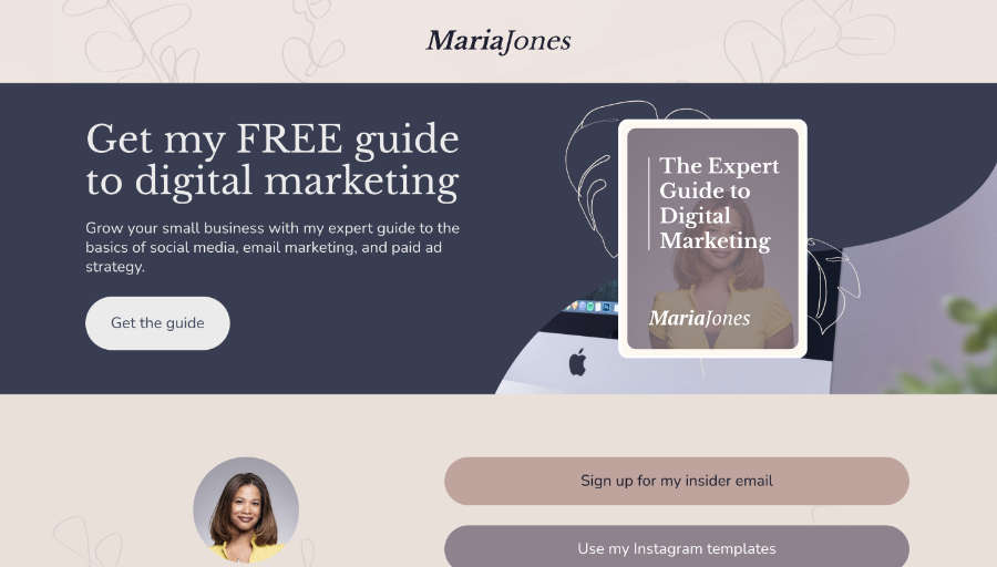
Streamlining Your Call to Action (CTA) for Better Conversions
Your Call to Action (CTA) is a crucial component of your landing page, acting as the direct link between visitor engagement and conversion. To maximize its effectiveness, consider these key points:
- Clarity and Visibility: Your CTA should be unmistakable and prominently displayed. Visitors should understand exactly what they’re expected to do with no ambiguity.
- Concise Language: Use action-oriented words that prompt immediate responses. Examples include “Download Now,” “Sign Up,” or “Get Started.”
- Visual Distinction: Employ a contrasting color for your CTA button to make it stand out visually from the rest of the page. This visual cue helps draw the user’s eye directly to the action point.
- Simplicity is Key: Avoid overcomplicating your CTA. A straightforward message reinforces what the visitor will gain by clicking, such as “Get Your Free eBook” or “Join Free for a Month.”
- Expectation Setting: Clearly communicate what happens next helps to manage expectations and reduce hesitation. This transparency encourages users to take the desired action, knowing exactly what they will receive in return.
Incorporating a vibrant, contrasting color not only makes your CTA pop but also commands attention, significantly enhancing the likelihood of engagement. This approach ensures that your CTA is not just seen but also acted upon, which can dramatically boost your conversion rates.
Remember, a simple and clear call to action resonates more effectively with users, as confusion often leads to inaction.
Keep your message direct and your design bold, and you’ll see an improvement in how visitors interact with your page.
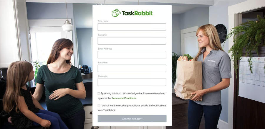
Optimizing Form Length for Increased Conversions
When incorporating a form on your landing page, it’s essential to streamline the amount of information you request.
Here’s how you can optimize your form to enhance user experience and increase conversions:
- Reduce the Number of Fields: Limit the form to only the essential fields. Each additional field may decrease the likelihood of form completion. Evaluate which information is crucial and eliminate any unnecessary inputs.
- Value User Time: Recognize that a user’s time and patience are limited. Lengthy or complex forms can frustrate visitors, increasing the chance they will leave without completing the form.
- Focus on Relevance: Ensure every field is relevant and directly beneficial to your objective. This not only respects the user’s time but also simplifies their decision-making process.
Keeping your forms concise and to the point can dramatically improve the user experience, leading to higher completion rates and, subsequently, more successful conversions.
Streamlining form fields not only makes the form filling process quicker but also less daunting, encouraging more visitors to complete the action you desire.
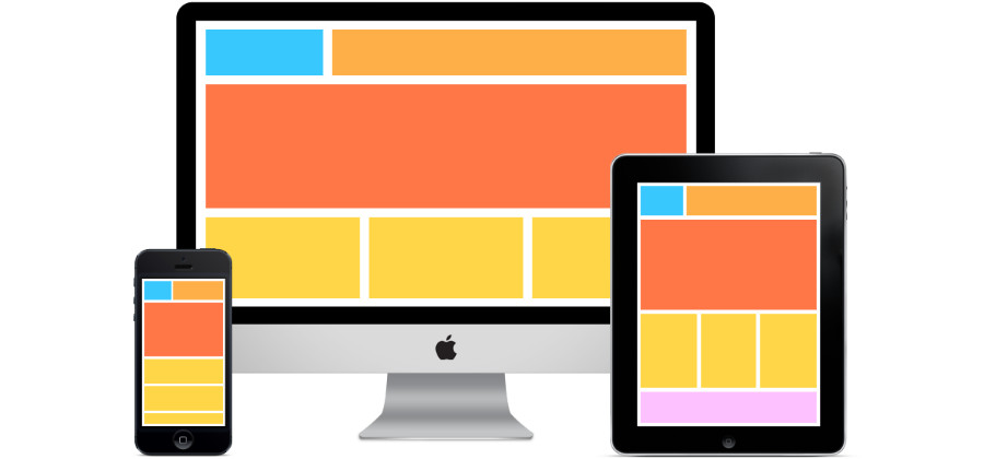
Design For Mobile
In today’s digital age, an increasing number of people use their mobile devices to browse the internet.
As a result, optimizing your landing page for mobile users is crucial. Your page should not only look appealing but also function flawlessly across various screen sizes.
Mobile optimization should be a core aspect of your web design strategy, moving beyond merely accommodating desktop users.
With the widespread use of mobile devices, ensuring your landing page is responsive to mobile is no longer optional but essential.
A well-designed mobile-responsive landing page enhances the user experience by ensuring that the page is visually attractive and operates smoothly on any device. Key elements of effective mobile web design include:
- Easy Navigation: Mobile users should find it straightforward to explore your page. Menus and buttons need to be easily accessible and functional on smaller screens.
- Fast Load Times: Mobile pages should load quickly to keep up with the on-the-go nature of mobile users. Optimizing images and streamlining code can help achieve faster loading times.
- Clear and Readable Content: Text on your mobile landing page should be easy to read without needing to zoom. Using legible fonts and adequate spacing is crucial for readability on mobile devices.
By focusing on these aspects of mobile design, you not only cater to a wider audience but also significantly enhance user experience, thereby increasing your opportunities for conversions.
This approach ensures that all visitors, regardless of the device they are using, have a positive interaction with your landing page, which is vital for driving successful outcomes.
Importance of A/B Testing in Landing Page Optimization
A crucial step in refining your landing page is to engage in A/B testing.
This process allows you to compare two different versions of your page—known as Version A and Version B—to determine which elements most effectively engage your audience and drive conversions.
A/B testing involves presenting these variants to users at random and analyzing the data on how each version performs in terms of user engagement and conversion rates.You might experiment with different aspects such as headlines, images, and calls to action (CTAs).
This experimentation not only helps pinpoint which components are most appealing to your audience but also provides critical insights that inform your ongoing web design strategies.
This method is not just about identifying the more effective option between two choices but also about understanding deeper user preferences and behaviors.
The feedback from A/B testing can be instrumental in continuously refining your design to better meet user needs.
Ongoing refinement, driven by what you learn through A/B testing, is essential for maintaining a landing page that performs well.
It ensures that your page stays current with user expectations and preferences, thereby maximizing its effectiveness in converting visitors into customers.
Remember, the goal is to create a landing page that not only looks good but also aligns perfectly with what your audience wants and needs.
Wrapping Up
Designing a great landing page is about more than just good looks—it’s about crafting a smooth journey that leads visitors straight to your goals. By putting these design tips into action, you’re not just tweaking aesthetics; you’re building pathways to better conversions.
Keep refining, keep it fun, and remember: the best landing pages don’t just catch the eye—they move people to action. Ready to watch your conversion rates climb? Let’s make your landing page a conversion machine.