
Typography is the art of arranging type to make written language legible, readable, and visually appealing.
In the digital age, the typography on your website speaks volumes about your brand before a visitor reads a single word. Typography encompasses everything from font selection to text layout. It significantly affects how users interact with your site.
In web design, typography plays a crucial role in shaping the overall user experience. It serves as the foundation upon which the visual hierarchy and content structure are built.
Artful typography can guide the reader’s eye, emphasize key information, and create a lasting impression. To harness the power of typography in web design, it is essential to understand its core elements.
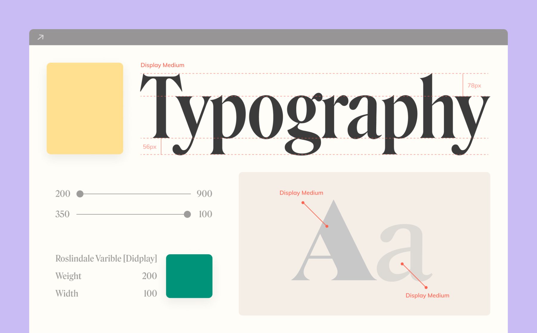
This includes selecting the appropriate font, considering typeface characteristics such as size, weight, and style, and leveraging the interplay between different typographic elements.
Crafting compelling font pairings is a hallmark of skilled web designers. By striking the right balance between complementary and contrasting typefaces, designers can establish a clear visual hierarchy and enhance the overall aesthetic appeal of the website.
Effective typography also involves the strategic use of color and texture, which can add depth and emotion to the textual content. Colors can evoke specific moods or associations, while textures can add a tactile dimension to digital experiences, making the interaction more engaging.Typography not only delivers content but also plays an integral role in the design’s emotional and aesthetic impact.
Moreover, typography in web design is not just about aesthetics but also about performance. Optimal typographic settings improve website readability, usability, and accessibility.
For example, good line length (measure), adequate spacing (leading and kerning), and clear font distinction (hierarchy) help reduce eye strain and enhance the user’s reading experience.
Incorporating these principles effectively requires a deep appreciation of the user’s needs and the context within which they interact with your digital platform.
A well-executed typographic strategy will align with the overall brand strategy, reinforcing the brand’s message and increasing the effectiveness of the website’s communication.
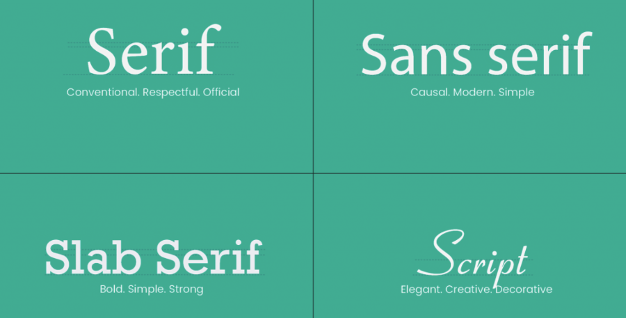
The Four Main Typeface Classifications in Typography
Each piece of text you read on a screen uses a typeface that influences the ambiance, tone, and visual layout of the content.
There is often confusion surrounding the distinction between typefaces and fonts, with many people using the terms interchangeably.
A typeface is a design style that encompasses a variety of letter sizes and weights, whereas a font is the graphical representation of the text structure.
In simple terms, a font is a family of related typefaces, while fonts refer to the specific typesetting weights, widths, and styles within that family. There are four main categories of typefaces commonly found on the web:
Serif and Sans Serif typefaces are the two most commonly used categories on the web.
Serifs are more conventional, consistent, and formal in appearance. They are often considered to improve the readability of lengthy paragraphs of text.
Sans-serifs, on the other hand, have a more casual and simplified aesthetic. They tend to render well on low-resolution displays, making them a recommended choice for web design. Both Serif and Sans-serif typefaces are widely used for body content, as well as headings, titles, and logos.
Slab typefaces are designed to be attention-grabbing, with their most distinctive feature being thick, bold strokes.
Script typefaces aim to emulate the varied and dynamic appearance of handwritten strokes. These are typically reserved for special applications, such as prominent headings or other design elements that require a more decorative touch.
Key Factors in Typography for Web Design
Readability and Accessibility
Readability is paramount in web design. The text must be clear, legible, and easy to read to communicate effectively. Choosing the right font size, type, and line spacing can greatly influence how information is perceived.
Optimal font sizes typically range from 16 to 24 pixels for body text, with headings and subheadings using larger sizes.
Accessibility is another critical factor. Your site should be accessible to everyone, including those with visual, cognitive, or other disabilities.
This means ensuring high contrast between text and background, using fonts that are easy to read, and providing alternatives for text-based content, such as captions or transcripts.
Contrast and Visual Hierarchy
Contrast helps in distinguishing text elements on a page, guiding the reader’s eyes through the content.
Effective use of contrast, such as dark text on a light background or vice versa, sets the tone and mood of the website.
It also helps individuals with visual impairments or color blindness to better perceive the content.
Visual hierarchy organizes content in a way that aligns with the user’s needs for information. Larger, bolder fonts often denote headings, with smaller fonts for subheadings and body text.
This hierarchy helps users quickly identify the most important information and navigate the content efficiently.
Consistency Across Pages
Maintaining a consistent typeface, font size, and style across all pages creates a seamless experience for users. It fosters a sense of familiarity, professionalism, and brand recognition.
Consistent typography also helps users anticipate where information is located on the page, improving their overall experience.
Responsive Typography
As digital screens vary greatly in size, from desktop computers to smartphones, responsive typography adjusts text size, line height, and spacing based on the device and screen dimensions.
This adaptability is crucial for maintaining readability and usability across different platforms, ensuring an optimal experience for users regardless of their device.
Implementing Typography in Web Design
Choosing the right typefaces is more than just picking what looks good. It involves a deep understanding of the website’s objectives and the demographics of its audience. Fonts should mirror the ethos of the brand and be functional.
For instance, a law firm might opt for Serif fonts to convey trustworthiness and professionalism, while a tech startup might go for clean, Sans-Serif fonts to reflect modernity and innovation.
Remember, the right typeface can significantly enhance brand recognition and reader engagement.
Creating a Visual Hierarchy
Effective typography uses a strategic arrangement of type to guide visitors through the content logically and intuitively.
This is done by prioritizing key information through various typographic techniques such as varying font sizes, employing bold or italic styles, and altering font weights.
For example, important headlines might be prominent and bold, subheadings slightly smaller but still distinct, and body text in a standard size and weight. This structured approach ensures that the most crucial information catches the eye first, guiding the visitor’s journey on the page.
Importance of White Space
White space plays a pivotal role in the overall design by providing visual breathing room around text elements. It helps in reducing cognitive overload, making content more approachable and scannable.
Effective use of white space is not about blank spaces but about the balance of spacing around and between elements to create a visually appealing and easy-to-navigate interface. For instance, increasing the space between paragraphs can help delineate sections clearly, making the text easier to follow.
Accessibility Standards
Meeting accessibility standards is crucial for creating an inclusive digital environment. This involves designing typography that everyone, including people with disabilities, can easily interact with.
Practical steps include ensuring high contrast ratios between text and backgrounds to aid those with visual impairments, using larger font sizes for readability, and providing functionality to allow users to modify text size as per their needs.
This commitment not only broadens your audience but also improves the site’s SEO and complies with legal standards.
Advanced Techniques in Typography
Fluid typography is an advanced technique that leverages CSS to create scalable text sizes which adjust dynamically to different screen widths.
This technique ensures that typography remains balanced and legible across all devices, from large desktop monitors to small mobile screens.
Implementing fluid typography typically involves using viewport width (vw) units for font sizes, combined with CSS media queries to adjust typography based on specific breakpoints. This adaptability enhances user experience by maintaining legibility and aesthetic consistency no matter the device used.
Typography can also embody a brand’s identity, using typefaces that convey the right emotions and messages.FAQ Section
Q: How do I choose the right typeface for my website?
A: Consider the message you want to convey, your brand identity, and the functional needs of your site.
Q: How do I create a visual hierarchy with typography?
A: Use different font sizes, weights, and styles to draw attention to the most important elements.
Q: How can I ensure my typography is readable?
A: Choose legible fonts and maintain high contrast between text and its background.
Q: What role does white space play in typography?
A: White space helps to break up text, making it easier to read and more visually appealing.
Q: What is responsive typography?
A: Responsive typography adjusts the text size based on the device it’s viewed on to ensure text remains legible and aesthetically pleasing.
Conclusion
Effective typography transforms how content is viewed and experienced on a website. It’s about more than just the choice of fonts — it’s about crafting an accessible and visually coherent experience that enhances communication and reflects the brand’s identity.
Make typography a cornerstone of your web design strategy to dramatically improve the usability and appeal of your site.